In Praise of 65:24 - The Lost Format
- Mike Page
- Jun 7, 2025
- 4 min read
A month later, I can't quite reproduce the exact sequence of events, but seemingly simultaneously I became more interested in panorama formats and Fotospeed published a video on panoramic papers. Somewhere deep in my memory of completely irrelevant data, I'd stored away an obscure aspect ratio that was used for panoramic images and I went down the rabit hole - so to speak. According to the extremely knowledgeable Jonas Dyhr Rask, who's a real fan of the format for street photography, the 65:24 format was first established by a collaboration between Hasselblad and Fujifilm back in the 90s, when they did the unthinkable to a 35 mm camera by sticking a unique, fixed aperture 45 mm lens on the front of the camera and exposing two frames together, giving rise to a 65x24 mm negative instead of the traditional 35x24 mm.

The dimensions of the paper that Fotospeed was lauding is 594x210 mm - essentially two sheets of A4 stuck together at the short end. Instead of an aspect ratio of 2.71 for 65:24, this gives a ratio of 2.83, meaning that keeping the 65:24 format would result in a 1.25 cm edge top and bottom [edit: right and left] on a horizontal image. The question is, whether to keep the historical 65:24 format or adopt a 65:25 aspect ratio! Does it make a difference at the end of the day? "2.71" happens to be Eulers Number, a mathematical constant used in logarithmic calculations. Did Hasselblad and Fujifilm take this into account when they deveolped Xpan, or is it just a coincidence? It's not the Golden Ratio (1.618), so will it make a difference at the end of the day?
Whatever the answer, ever since I bit the bullet and ordered Fotospeed's test box of panoramic papers, I've been hunting for panoramic images which might be suitable for printing. After a month, I've acquired two groups of images. The first group is close-ups and detailed scenes, the second more classical landscape scens.
Intimate Panoramas


As well as the classic horizontal format, the 65:24 ratio can also be used vertically such as with this beautiful spring foxglove taken on Exmoor in May this year. Again I took this shot explicitly with this format in mind.

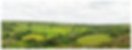
Landscape Panoramas
The more traditional use of the panoramic format is of course the landscape. Whereas the Alps and Dolomites don't necessarily immediately lend themselves to such wide panoramas, the more gently rolling hills of the English countryside seem predestined to be represented in this way.


Printing
An image isn't really finished until it's been printed. This still isn't a process that I feel completely at home with; there's still a lot of trial and error involved and I need to waste ink and paper with test prints to get it right. As I see it, there are essentially three challenges to be mastered: brightness, colours and paper. If you're interested in exploring any of these concepts more deeply, I would strongly recommend a deep-dive into Keith Cooper's YouTube channel. Keith is one of the best educators out there for anything to do with digital printing.
Brightness: Most of us edit our photos on back-lit screens that are set too bright. Consequently, the resulting prints end up much too dark. Correcting screen brighness (and colours) using a calibrator can overcome this, but I've found that boosting exposure by around 0.5 stops brings the prints to an acceptible level.
Colour: Even with a calibrated screen, there are differences in colour between what is displayed on the screen and the inks used in the various printers.
Paper: Leaving the actual hue of the paper aside, different papers absorb and display inks in different ways and require different amounts of ink. Fotospeed includes a cheat-sheet indicating which paper types to select in the Canon system to get the best results for each image.
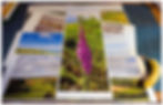
After a couple of test prints on the A4 sheets delivered with the panorama sheets it was time to open up the back of the printer and perform the final step in the photographic process: printing.
From top to bottom the photos were printed on Platinum Barayta (Corfe Castle), Smooth Cotton (Porloc Weir Pilings), Smooth Pearl (Lynton and Lynmouth Coast) and Matt Ultra (Tarr Hills and Foxglove). With the exception of the Lynton and Lynmouth Coast image, they all came out brilliantly. I don't know whether I got the wrong paper type set up or what, but the details look a bit mushy.
I'm very happy with both the brightness levels and colours. I think I'm beginning to get the hang of this printing lark.
Now. Where am I going to put them all???